How We Managed 95+ in all Google Lighthouse Categories, Part 2 – Accessibility
Achieving a Google Lighthouse score of 90+ has become a personal goal for our website. It’s not that we care much about competition, but as a web development company, having a super-fast, well-ranking website does have its advantages.
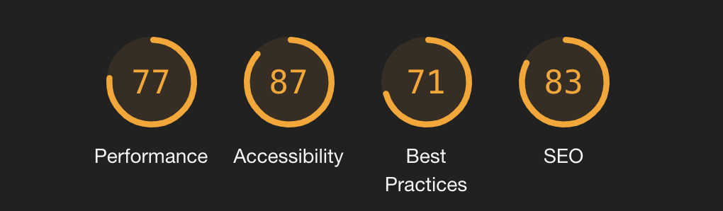
Google lighthouse measures website metrics in four categories; Performance, Accessibility, Best Practices, and SEO. Part 2 of this series will focus on accessibility.
Accessibility
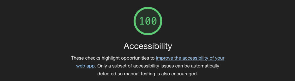
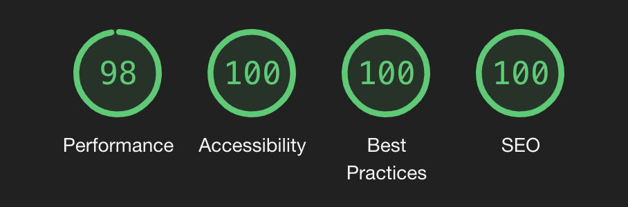
We’re quite proud that we were able to achieve a perfect Accessibility score on our home page. This not only demonstrates our commitment to web development standards, it should also help those with disabilities navigate our site effectively.
Unlike Performance Audits, Google’s Lighthouse measures accessibility on a pass/fail system. Essentially there is a list of audits that one must pass in order to get the ‘points’ for that audit. Each audit is worth a certain number of points and if you manage to pass all of them, you score 100.
Our Advantage
Mindshare’s website is actually quite simple in terms of content and what it needs to do. We don’t have much embedded material like iframes or videos, there are not many interactive forms, most of the functionality is your standard fare. Our content is made up of the basics (images and text).
In other words, our job of making this site accessible was made easier by the simplicity of our content. This means that many of the accessibility audits measured by Lighthouse don’t apply.
Audits that We Failed
Despite the simplicity of our website, we failed a few important audits; poor contrast ratio between background and foreground elements, skipping heading levels, missing ‘alt’ attribute on image tags, and missing discernible link names.
Poor Contrast Ratio
This audit measures the contrast ratio between, say, text and the background it’s placed on. As you can imagine a low contrast ratio can make the text hard to read, especially for color blind or visually impaired individuals.
Mindshare had quite a big problem when it came to this metric, our brand colors were too limited to allow us to increase the contrast ratio while maintaining our brand aesthetic. What this effectively meant: we needed to adjust our brand in order to make our website (and other brand collateral) more accessible.


We decided to take this opportunity to adjust not only the colors associated with our brand, but to also refine our shapes. We last established these shapes and colors in 2016… five years ago.
With these new colors it was possible to adjust our link, heading, text and other element colors to have better contrast ratios… essentially, we had more options which allowed us to achieve a striking website design, while maintaining and improving accessibility across all our brand materials.
Skipping Heading Levels
Heading elements help to establish a content hierarchy and organization of web pages. Assistive technologies use these as a sort of table of contents. So, it’s important that headings are presented in order on the page. Essentially, header tags (<h1>) need to be ordered sequentially.
Here’s an example of a simple page layout:
<h1>Heading 1 - Page Title</h1>
    <h2>Heading 2 - Section Title</h2>
        <h3>Heading 3 - Sub Section Header</h3>
            <p>Paragraph content...</p>
            <p>Paragraph content...</p>
        <h3>Heading 3 - Sub Section Header</h3>
            <p>Paragraph content...</p>
            <p>Paragraph content...</p>
    <h2>Heading 2 - Section Title</h2>
        <h3>Heading 3 - Sub Section Header</h3>
            <p>Paragraph content...</p>
            <p>Paragraph content...</p>
        <h3>Heading 3 - Sub Section Header</h3>
            <p>Paragraph content...</p>
            <p>Paragraph content...</p>
This was a simple, but time consuming, fix for us. We simply adjusted the headers that we used on various pages and re-ordered some content.
Missing ALT Attributes
Informative images elements should have ALT attributes associated with them. These pieces of short text help to describe what the image showcases and is especially important for screen readers and other assistive technologies. Without these attributes, a screen reader cannot discern what the image showcase and there important content can be missed.
This was another rather simple fix, we added alt attributes to all of our image tags across the site.
Missing Discernible Link Names
Link text that is discernible, unique, and focusable improves the navigation experience for users of screen readers and other assistive technologies.
web.dev/link-name
This particular audit only showed up in one place on our website: the home page (uhg!). On our home page we have a list of services and within each service card we had a button that simply read “Read more”. Little did we know, 8 buttons all with the text “Read More” made for frustrating navigation while using accessibility devices. So, instead of using the text “Read More” we changed it to reference where the link actually leads, ex: “Responsive Website Design” or “Progressive Web Applications.”
This simple change means that our website is easier to navigate using assistive devices.
TLDR;
Using built in WordPress functions and responsible website development. we improved our Google Lighthouse accessibility score from 87 to 100. We were able to pass every accessibility audit.
Keep an eye out for parts 3-4 where we talk about Best Practices, and SEO. Also, check out Part 1 – Performance.